Colourful Nursery Ideas: How to Design a Bold Room Your Baby Can Actually See
Every nursery mood board on Pinterest looks the same. Soft grey walls. Beige linen curtains. A single watercolour cloud print above the cot. It is beautiful in photos. The problem is that your baby cannot see any of it.
Newborns are drawn to bold colour boundaries and high-contrast patterns. Their developing vision literally cannot register pale sage against off-white. If you want a nursery that works for your baby and not just for the grid, you need colour. Real colour. The kind that makes you slightly nervous when you pick up the paint swatch.
This is a practical guide to creating colourful nursery ideas that look intentional, feel bold, and give your baby something their brain is genuinely hungry for. No ball pits. No chaos. Just smart use of colour that happens to be backed by actual developmental science.
Why the "Calm Nursery" Trend Gets It Backwards
The idea that babies need a calm, muted environment is everywhere online. Soft colours, minimal visual stimulation, gentle tones. It sounds logical. But it is based on what adults find relaxing, not on what babies can actually perceive.
In the first weeks of life, a newborn's visual acuity is roughly 20/400. They see best at about 20 to 30 centimetres, and beyond that distance everything is a blur. Within that blur, the only things that register clearly are high-contrast edges: dark against light, bright against bright.
A pale grey wall with a cream shelf and a white cot? To your baby, that is one big indistinct blob. A bold red circle against a blue background? That they can see. And seeing things clearly is how their brain starts building the neural pathways for focus, tracking, and pattern recognition.
I am not saying your nursery needs to look like a soft play centre. But if the only colour in the room is a dusty pink cushion on a grey chair, your baby is getting very little visual stimulation from the space where they spend most of their waking hours.
For the full month-by-month science of how baby colour vision develops, I wrote a detailed breakdown in When Can Babies See Colour. The short version: bold colour matters from about six weeks, and it matters a lot from three months onward.
The Rules for Bold Colour Without Chaos
Bold does not mean messy. The difference between a nursery that looks intentionally colourful and one that looks like a paint explosion comes down to a few practical rules.
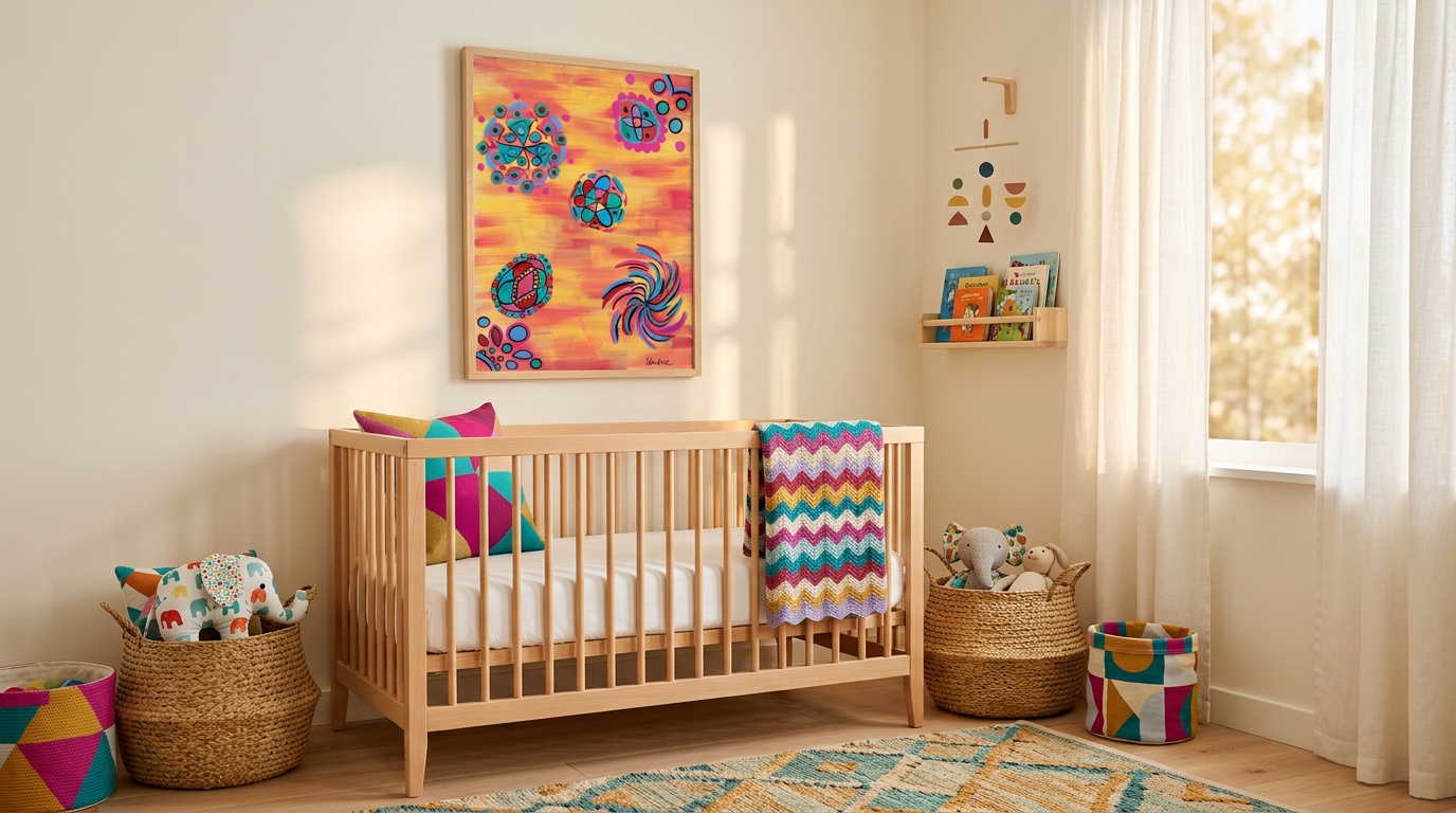
Pick one anchor colour. Choose a single bold shade that will be the dominant accent: orange, teal, magenta, cobalt blue, tomato red. This colour should appear in at least three places in the room. A print on the wall, a cushion or throw, and one smaller object like a storage basket or lamp. Three touchpoints make a colour feel deliberate. One touchpoint makes it feel accidental.
Keep the walls simple. You do not need to paint every wall a bold colour. White or cream walls with bold art and colourful textiles is the most effective combination for a nursery. The neutral backdrop makes the colour pop, and it gives your baby's eyes the clear contrast they need. One accent wall works well too, but keep the opposite wall calm so the contrast is intentional rather than overwhelming.
Limit your palette to three colours maximum. Three bold colours plus a neutral (white, cream, or light grey) is the sweet spot. More than three and the colours start competing with each other. Fewer than two and it reads as a single accent rather than a colourful room.
Repeat, do not scatter. If you have an orange cushion on the nursing chair, pick up that same orange somewhere else in the room. In the frame of a print, in a stripe on a blanket, in the spine of a book on the shelf. Repetition makes a colour scheme feel cohesive. Scattered single instances of lots of different colours is what creates visual chaos.
Where to Put Colour in the Nursery
Not every surface needs to be bright. The most effective bold nursery decor puts colour where your baby actually looks.
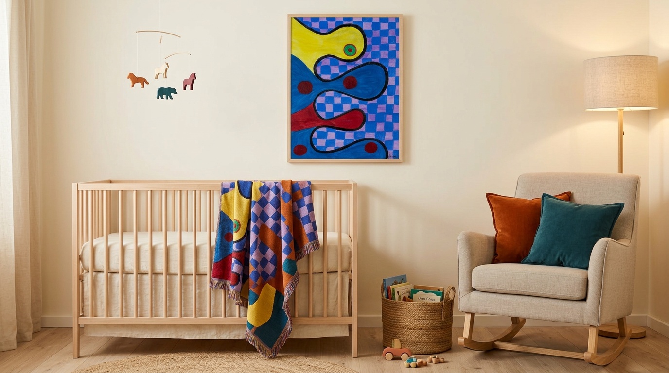
The cot wall. This is the most important wall in the room for the first three months. Your baby spends hours facing it, lying on their back with nothing else to look at. A single bold artwork here, hung about 30 to 35 centimetres above the cot rail, gives them something genuinely interesting to engage with. I cover exact placement heights and print sizing in How to Choose Nursery Wall Art.
The changing station wall. Second most looked-at surface in the nursery. During every nappy change, your baby is on their back looking at the ceiling and the wall behind your head. A bold print or two here gives them something to focus on, and parents tell me it genuinely makes the process calmer. A baby who is visually engaged fusses less.
The floor, for tummy time. From around two months, tummy time becomes part of the daily routine. A bold print propped against the skirting board at floor level, or a high-contrast play mat, gives your baby visual motivation to lift their head and stay engaged. Robo Friend and Bouncy Blobs both work brilliantly for this because of their strong geometric shapes and thick black outlines.
What you can keep neutral. Ceiling, large furniture, curtains, and rugs. These are the expensive items that are painful to replace, and keeping them neutral means you can swap colourful accents as your child grows without redecorating the entire room. The colour comes from art, textiles, and accessories. The architecture stays calm.
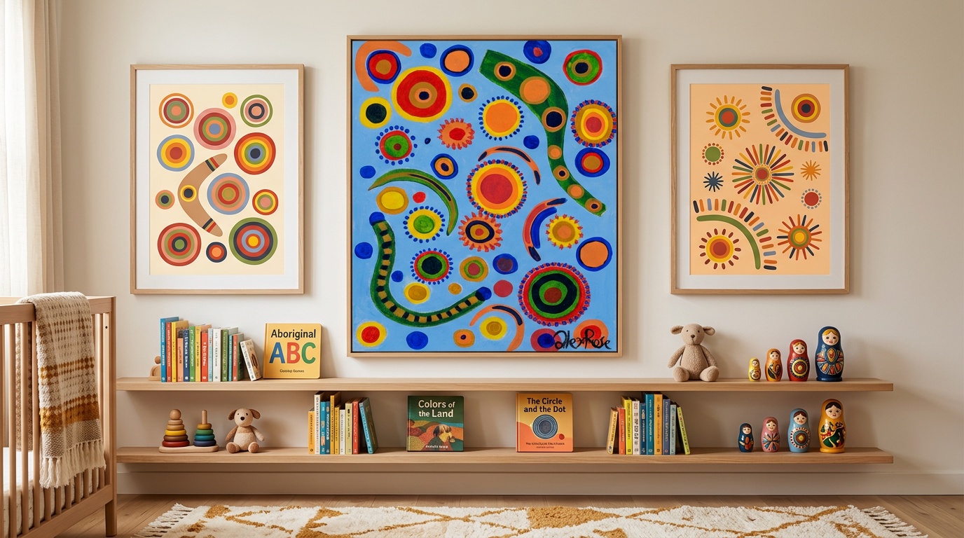
How to Build a Gallery Wall That Babies Love
A gallery wall is one of the best ways to add colour to a nursery without committing to a single oversized piece. But there is a difference between one that looks good on camera and one that actually works for developing eyes.
Size matters more than quantity. Three A3 prints will always beat six A5 prints. Babies cannot resolve fine detail until around four to five months, so small frames viewed from across the room are just texture to them. Go bigger than you think you need to. An A3 print (297 x 420mm) is the minimum I recommend for a nursery gallery wall.
Space them tightly. Keep 5 to 8 centimetres between frames. Tight groupings create a single visual block that reads as one large area of colour and pattern. Wide spacing breaks the wall into isolated patches that lack visual impact from a distance.
Mix orientations. One landscape and two portrait prints, or two landscape and one portrait. Mixing orientations creates visual variety. Avoid identical frames at identical spacing in a straight row. That is a corporate waiting room, not a nursery.
Choose pieces that share a palette. This is the most common mistake I see. Five prints from five different artists in five completely different colour palettes creates a wall that looks confused rather than curated. Pick pieces that share at least two colours. Circle Dance and Flying Colours both use bold reds, blues, and greens on blue backgrounds, so they sit together naturally. Dreamy Bubbles and Candy Swirl share pinks and oranges and work well paired.
Hang it low. For the first six months, your baby is lying down or being held at chest height. A gallery wall centred at adult eye level (about 150cm from the floor) is entirely above their sightline. Centre the arrangement at roughly 100cm instead. Yes, it will look slightly low to you. It will be perfect for them. You can always move it up later.
Four Nursery Colour Schemes That Actually Work
Here are four specific palettes I recommend to parents. Each one provides the high-contrast colour boundaries that babies are drawn to while looking intentional and genuinely beautiful.
Palette 1: Sunset (warm, energetic). Orange, magenta, and cream on white walls. This is the palette behind my painting Jungle Adventure. It is warm without being aggressive, and the orange-magenta contrast is one of the strongest chromatic pairings you can create. Start with an A3 print and an orange cushion. Add a magenta storage basket or blanket. Done.
Palette 2: Ocean (cool, striking). Cobalt blue, teal, and bright white. Clean, bold, and works particularly well in south-facing rooms with lots of natural light. Bubble World brings this palette to life with sky-blue backgrounds and bold circular shapes in warm accents.
Palette 3: Carnival (maximum contrast). Red, yellow, and blue on black or very dark grey accents. The classic primary palette. It is not subtle. It does not pretend to be subtle. And it provides the absolute strongest colour contrast available outside of pure black and white. Three Friends is this palette in painting form, and it is consistently the piece parents tell me their baby locks onto first.
Palette 4: Garden (natural but vivid). Leaf green, hot pink, and sunshine yellow on cream walls. Fresh and energetic without feeling clinical. Sunny Blooms captures this combination perfectly, with turquoise, orange, and blue flower shapes on a bright purple and green ground.
For any of these, start with one A3 print and a couple of matching textiles. If it feels right after a week, add more. You do not need to commit to a full room scheme on day one.
What to Avoid
Themed decor that dates. Elephant prints, woodland animals, "dream big little one" vinyl lettering. These things have a shelf life of about eighteen months before they start looking tired. Abstract art does not have this problem. A bold painting looks as fresh in a teenager's bedroom as it does in a nursery. You buy it once, and it grows with your child.
All-pastel rooms. Pastels are not bad. But a room where pastel is the only colour present is a room with very low visual contrast. If you love pastels, use them for large surfaces like walls and curtains, and add bold pops of saturated colour through art and accessories. Pastel walls plus bold art is a genuinely lovely combination.
Matching everything. A nursery where every item is the same shade of blue is a nursery with no contrast. If the walls are blue, the art should not also be blue on blue. Contrast is the entire point. A bold orange print on a blue wall creates far more visual interest for both you and your baby than a blue print on a blue wall.
Tiny prints on big walls. An A5 print on a 3-metre wall is a postage stamp. It looks lost from the doorway, and your baby cannot see it from their cot 2 metres away. If the wall is big, the art should be big. A2 is the minimum for a feature wall. A3 for smaller walls or grouped arrangements.
FAQ
Is a bold nursery too stimulating for a newborn?
No. The idea that bold colours overstimulate babies is a myth with no evidence behind it. Newborns self-regulate by simply looking away when they have had enough visual input. What they actually need is something worth looking at. A blank, muted room gives them nothing to engage with, which is less helpful for visual development than a room with clear, high-contrast visual interest.
What if I do not like bold colours myself?
You do not have to paint the walls neon orange. A neutral room with two or three bold art prints and a few colourful accessories is more than enough. The colour comes from the art, not from the architecture. When your child eventually moves to a bigger bedroom, the prints move with them and your room goes straight back to its original state.
Can I mix bold art with pastel furniture?
This is actually one of the best combinations. Pastel or neutral furniture keeps the room feeling soft and approachable, while bold art provides the high-contrast visual stimulation your baby genuinely benefits from. The contrast between a soft background and vivid artwork is part of what makes it effective.
How often should I rotate the art?
Every four to eight weeks in the first six months. After that, every couple of months or whenever you notice your baby has stopped engaging with a particular piece. Abstract art stays relevant much longer than illustrated baby art because there is no character or story to outgrow. Most of my prints work from birth through to school age and well beyond.
Do I need to spend a lot on nursery art?
You need art with genuine visual quality: bold colour, strong contrast, clear shapes. You do not need original oil paintings. Museum-quality prints of real hand-painted artwork give you the colour impact and visual detail that matters, at a fraction of the price. My prints start from £19 for an A4, and an A3 at £29 is the most popular nursery size.
The nursery is the first room your baby will ever know. It shapes their earliest visual experiences, during a period when their brain is forming connections faster than it ever will again. A room with bold colour and strong contrast is not just more interesting to look at. It is giving your baby's visual system real material to work with.
Start with a single bold print above the cot and watch how your baby responds. I have seen sceptical parents become completely converted in a single afternoon, the moment their little one locks onto a painting and just stares.
Browse the full collection to find the right piece for your nursery. Every print starts as a real hand-painted original, printed on archival paper, and shipped worldwide. If you are not sure where to begin, Robo Friend and Three Friends are consistently the two pieces babies respond to first.