The Complete Montessori Nursery Art Guide: What Actually Belongs on Your Baby's Walls
Montessori nurseries have a bit of an image problem. Search "montessori nursery art" and you'll mostly find beige linen, white walls, and rooms so stripped back they look like a very tasteful office in a Scandi furniture catalogue. No colour. No personality. Definitely no art.
That is not what Maria Montessori was describing. And it's not what serves your baby.
This guide is for parents who want to understand what Montessori principles actually say about art and the prepared environment, and then make practical decisions based on that, rather than copying an aesthetic from someone's Instagram.
I'm not a certified Montessori teacher. I'm a mum who has spent a lot of time with Montessori's actual writings, and I also happen to paint bold abstract art. The more I read, the more convinced I became that my work belongs in a Montessori nursery. Let me show you why.
What Montessori Nursery Art Actually Means
Maria Montessori wrote extensively about the prepared environment -- the idea that the physical space around a child should be intentionally designed to support their development, independence, and sense of beauty.
In The Absorbent Mind (1949), Montessori describes the environment as "a living part of the lesson." She wasn't talking about a neutral space. She was talking about a space that actively teaches by being beautiful, ordered, and real.
On art specifically, Montessori was clear: children should be surrounded by real art, not simplified cartoon versions of the world. She believed children deserve the same aesthetic respect as adults. A child looking at a wall is having a visual experience just as valid as yours. What do you want that experience to be?
Her writings also stress sensory richness. The sensorial materials she developed -- the colour tablets, the geometric solids, the tactile boards -- were designed to give children's senses precise, engaging things to work with. A nursery environment should do the same. This is not the beige minimalism the internet has decided represents Montessori. Sensory richness means colour, contrast, texture, real shapes.
The NHS guidance on infant vision development notes that babies need visual stimulation from the earliest weeks. Montessori would not disagree. She simply believed that stimulation should come from the real and the beautiful, not the plastic and the manufactured.
The Myth That Montessori Means Beige
This is worth addressing directly because it shapes so many nursery decisions.
The beige-Montessori aesthetic comes partly from a misreading of Montessori's emphasis on order and calm. She did say that chaotic, cluttered environments overwhelm children. That's true. But the solution to chaos is not the removal of all colour. The solution is intentional, curated beauty.
Montessori classrooms contain real wooden materials in natural tones, yes. But they also contain real flowers, real art prints at child height, real objects from the natural world. Colour is absolutely present -- it's one of the primary sensorial categories Montessori materials address. The colour tablets, used from around 18 months, teach children to match and grade 63 different shades across 11 colour families.
The beige nursery trend is a design trend. It is not a Montessori directive.
What Montessori is actually opposed to: novelty characters, cartoon simplifications, bright flashing lights, ten competing patterns on one wall, plastic toys with recorded sounds. Not colour. Not art. Not beauty.
Bold abstract art -- a single piece, well chosen, well placed -- is exactly what Montessori's prepared environment calls for.
Why Abstract Art Is More Montessori Than Cute Animal Prints
Most "nursery art" on the market falls into two categories: cartoon animals and generic inspirational quotes. Neither is particularly Montessori.
Cartoon animals are simplified, stylised versions of real animals. They don't look like actual birds or foxes. They look like a graphic designer's idea of what a baby wants to see. Montessori was quite specific that children should be introduced to the real world -- real objects, real plants, real art. If you want to put animals on the wall, a nature photograph or a botanical print is more Montessori than a doe-eyed cartoon deer.
Abstract art is different. A genuine abstract painting isn't a simplified cartoon. It's real art made by a real person, expressing real emotion through colour, shape, and movement. It doesn't condescend to the viewer -- child or adult. It presents something honest and asks the viewer to engage with it directly.
From a developmental standpoint, abstract art also does something that cartoon art doesn't: it gives babies open-ended visual information to process. A cartoon bunny tells the brain "bunny." An abstract painting with bold circles and contrasting colours gives the visual cortex a genuine workout -- tracking edges, registering colour relationships, following curves. If you've read my post on why abstract art supports your baby's visual development, you'll know that the science backs this up strongly.
The other advantage of abstract art is that it doesn't expire. A cartoon animal nursery becomes a source of gentle embarrassment by the time your child is four and has opinions. A bold abstract painting on their wall is still good art when they're fourteen.
How to Set Up a Montessori Art Space
Montessori's guidance on art in the prepared environment comes down to a few key principles. Here's how to apply them practically.
Hang Art at Child Height
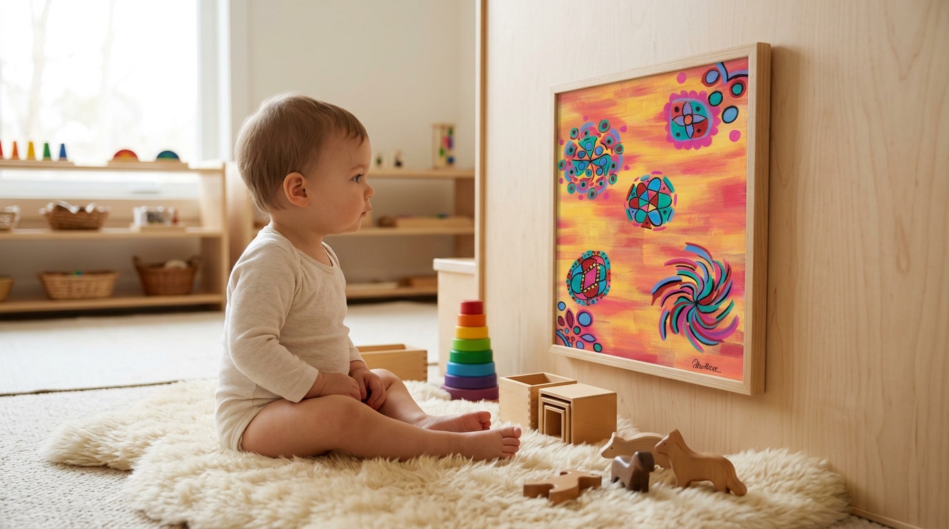
This is the most important and most consistently ignored principle. Art belongs at the height of the person looking at it.
In a Montessori nursery, this means low. For a newborn lying on a tummy mat, you're thinking about art hung 40-60cm from the floor, so the centre of the piece sits at approximately the height of their gaze when lying prone.
At 3 months, babies can focus most clearly on objects 30-50cm away. If a piece of art is hung at adult height (1.2-1.5m from the floor), your baby on their tummy mat simply cannot see it properly. They're looking at a blurry smudge of colour. Hang it low, and suddenly they have a focal point for every tummy time session -- one that actively engages their developing vision.
By 6-8 months, when your baby is sitting independently and pulling to stand, the art can move up slightly -- but still lower than adult convention dictates. The centre of the frame at 70-80cm works well for a sitting baby. This is approximately the height of a sitting child's eye level, which puts the piece squarely in their visual field rather than floating above their head.
For a walking toddler, the Montessori convention is the same as for adults in a gallery: the centre of the piece at eye height. For a 2-year-old, that's roughly 90-100cm from the floor.
Use an Art Rail to Make Rotation Easy
One of the most practical things you can do for a Montessori nursery is install a picture rail (or a simple wooden ledge shelf) low on one wall. This lets you rotate artwork without putting new holes in the walls every time.
Rotation matters because it mirrors Montessori classroom practice. In a Montessori classroom, materials are rotated to maintain freshness and continued engagement. The same applies to nursery art. A painting that has hung in the same spot for six months is barely visible to your child anymore -- it's become part of the furniture. Swapping it for something new reactivates their attention.
A simple system: 3-4 prints in rotation, swapped every 4-6 weeks. You don't need a huge collection. Three or four pieces that you genuinely love and that suit different moods or seasons is plenty.
One Focal Piece, Not a Gallery Wall
The Pinterest gallery wall is the opposite of Montessori thinking. Nine frames of varying sizes, mix of prints and photos, some with text, competing patterns, arranged in an asymmetric cluster? That's visual chaos for a developing brain.
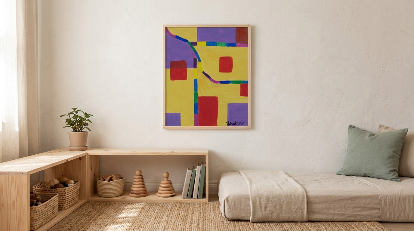
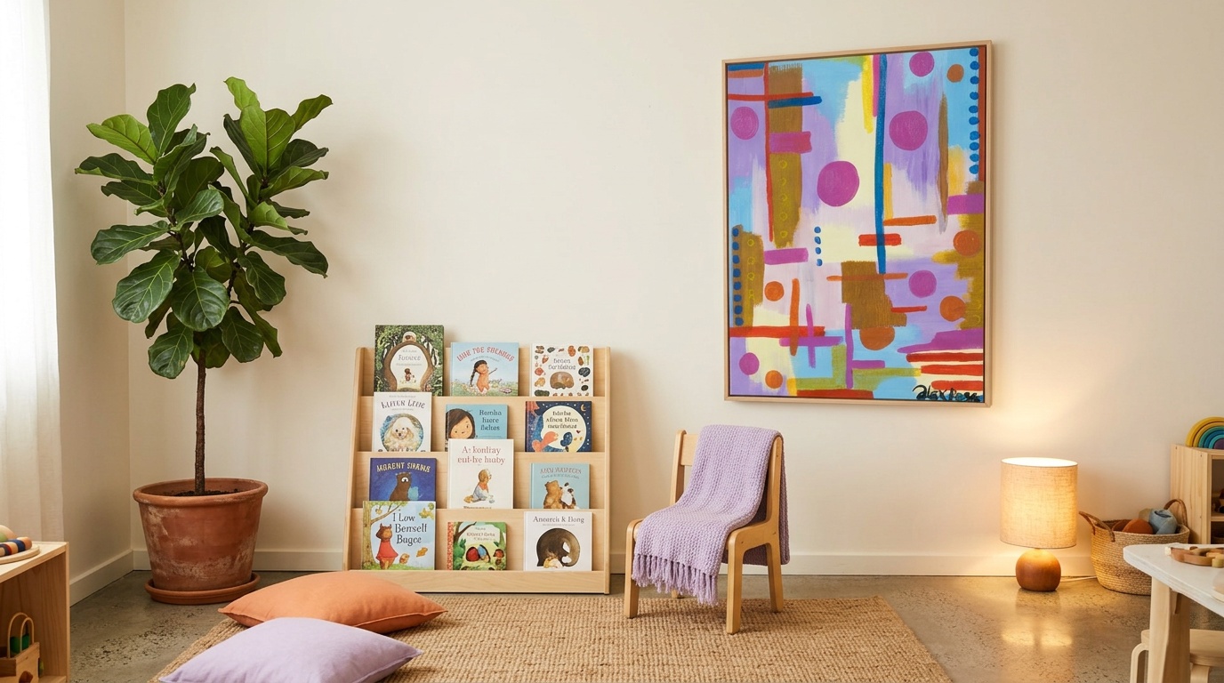
Montessori's prepared environment favours one beautiful thing at a time, well placed and well lit. One print, large enough to see clearly from across the room, centred on a wall. That's the Montessori approach to art display.
If you have multiple pieces you love, rotate them. That's better than showing all of them simultaneously and having none of them actually seen.
Maria Montessori's Prepared Environment: The Key Texts
For anyone who wants to go deeper, the primary sources are worth reading rather than relying on secondhand summaries.
The Absorbent Mind (1949) is the most directly relevant. Chapter 7 covers the prepared environment in detail, including the role of beauty and order. Montessori writes: "The environment must be rich in motives which lend interest to activity and invite the child to conduct his own experiences."
The Discovery of the Child (originally published as Il Metodo, 1909, revised 1948) covers the sensorial materials and the role of the environment in sensory development. This is where the most specific guidance on visual materials appears.
The Secret of Childhood (1936) has some of the most accessible writing on how children perceive the world and what the adult role is in preparing their environment.
None of these texts suggest beige walls. All of them suggest beauty, order, and genuine engagement with the real world.
Artwork Recommendations from the Collection
Based on Montessori principles -- real art, strong visual information, not cartoons -- here are pieces from my collection that work particularly well in a prepared environment.
Circle Dance is probably my most Montessori-aligned piece. Bold concentric circles in red, yellow, and blue against a sky-blue background give babies precisely the kind of circular forms and colour contrasts that Montessori sensorial materials focus on. The repeating patterns support visual tracking without becoming chaotic. It works at floor level for a newborn and looks equally good as a feature piece for an older child.
Bouncy Blobs has three distinct bold shapes -- yellow, blue, red -- against a checkerboard background. The strong colour separation and clear forms make each element easy for a developing visual system to process individually. There's also a gentle movement quality to the shapes that babies respond to strongly.
Jungle Adventure offers the most visual richness of any piece in the collection -- concentric circles interwoven with curving green shapes on a bright background. This is a good piece for a slightly older baby (4-6 months plus) who is ready for more complex visual information and can track multiple elements in a composition.
For a calmer prepared environment, Dreamy Bubbles in softer pinks, lavender, and cream provides genuine visual interest without the intensity of the brighter pieces. It works well in a room that gets strong natural light, where the more vivid pieces can feel a bit much in the afternoon.
The full collection is at /gallery -- each piece is available as an A4, A3, or A2 print, which matters for placement: an A2 (594mm tall) hung at child height becomes a proper visual anchor for the room. An A4 in the same position barely registers.
How to Rotate Artwork as Your Baby Grows
Here's a practical rotation schedule based on developmental stages.
0-3 months: Floor level, high contrast
Hang one print 40cm from the floor, close to the tummy mat area. The centre of the piece should be at roughly 50-60cm height. Bold, high-contrast pieces work best -- Circle Dance, Bouncy Blobs, or Three Friends. At this stage your baby can only focus 20-30cm away, so the art is most useful during tummy time when they're close to the floor.
3-6 months: Move up slightly, introduce more colour
As visual range extends and colour perception develops (most babies can distinguish all main hues by 4 months), move the art up to 60-70cm centre height. This is also a good time to introduce a second piece into rotation. Jungle Adventure or Flying Colours work well at this stage -- more visual complexity for a brain that's ready to process it.
6-12 months: Sitting height, bigger pieces
When your baby is sitting independently, 70-80cm centre height works well. This is also a good point to size up. An A2 print makes a much stronger visual impression than an A4, and the larger format holds attention better as babies become more mobile and start looking around the room more actively.
12-24 months: Low toddler height, rotation every 4 weeks
A walking toddler needs art at roughly 90-100cm centre height. At this stage, they'll start pointing at art, naming colours, making associations. Rotation becomes more interesting because they notice and react to the change. Four weeks is about right -- long enough to really absorb a piece, short enough that swapping it registers as genuinely new.
What to Avoid
Competing patterns on every surface. A bold piece of art loses all impact if it's hung next to a striped curtain, above a patterned rug, across from a wall covered in vinyl stickers. Montessori's principle of order means giving each beautiful thing space to be seen.
Novelty character art. This is the one I feel most strongly about. Cartoon characters are not art. They are commercial products using simplified imagery designed to sell toys. They carry no aesthetic weight and offer children a diminished visual experience. If you want your child surrounded by beautiful things from the start, this category is the one to skip entirely.
Text and quote prints. "Dream Big Little One" in a script font is not visually interesting to a baby. It's designed to make adults feel something. Save the wall space for something that actually works for the person in the room.
Too much, too soon. The temptation when setting up a nursery is to fill every surface. Less is genuinely better here. One strong piece, properly placed, properly lit, does more developmental work than a wall full of competing elements.
Every baby develops at their own pace, and what works visually for one child at three months may be more or less engaging for another. Observe your baby's responses and adjust accordingly.
FAQ
What size print works best for a Montessori nursery?
For floor or low-wall placement (0-6 months), an A3 is the minimum size worth considering -- smaller pieces simply don't have enough visual weight at a distance. An A2 is genuinely better. The larger the print, the more visual information is available and the further away it can be seen clearly.
How many artworks should a Montessori nursery have?
One displayed at a time, with three or four in rotation. Displaying multiple pieces simultaneously creates the visual noise that Montessori's prepared environment is designed to avoid. Rotation keeps the space fresh without requiring more purchases.
Is black-and-white art more Montessori than colour?
No. This is a persistent myth. High-contrast black-and-white art is useful in the first few weeks when a newborn's colour vision is not yet developed (roughly the first month). By 3-4 months, full colour vision is largely in place, and colour-rich art becomes more appropriate and more stimulating. Sticking to black-and-white art past the newborn stage is limiting rather than Montessori.
Does the art need to be framed?
Montessori's emphasis on beauty and care for the environment suggests that yes, presentation matters. A print in a simple frame looks more intentional and more beautiful than a print stuck to the wall with tape. It also signals to the child that this is something worth looking at -- that the object has been given care. Simple black or natural wood frames suit most abstract prints well and keep the focus on the art rather than the frame.
What about the rest of the nursery walls?
Leave them. Unpainted plaster or a single muted colour lets the art work. If you want to add anything else, a low wooden shelf with a single plant, a small wooden object, or a basket of natural materials is in keeping with Montessori principles. Vinyl wall decals, borders, or themed murals all compete with the art and dilute the impact.
The thing about Montessori principles is that they make you look at everything in the nursery more carefully -- including what's on the walls. Not because there are strict rules, but because the underlying question ("does this serve the child's development and sense of beauty?") is a genuinely useful filter.
By that measure, a single bold abstract print hung at the right height, rotated thoughtfully as your baby grows, and given space to breathe on an uncluttered wall is about as Montessori as nursery art gets.
Browse the full print collection to find the right piece for your nursery. Each artwork is available in A4, A3, and A2 -- and if you're not sure which size, go bigger than you think.