High Contrast Art for Babies: What the Science Actually Says
Your newborn is not looking at your face the way you think they are.
In the first weeks of life, the visual system is so underdeveloped that a face from across the room might as well be a beige wall. What draws a baby's gaze is contrast, pure and simple. Not colour. Not detail. Not the cute woodland animal print you spent three weeks choosing. Contrast.
This is the single most useful piece of developmental science I have ever come across as a mum, and it completely changed how I think about the art I make.
What "High Contrast Art Babies" Actually Means
When people talk about high contrast art for babies, they usually picture black-and-white flash cards. Zebra stripes. Bold concentric circles. And yes, that basic idea is rooted in real science.
But there is a lot more going on underneath the surface, and once you understand the actual neuroscience, you realise why hand-painted art with all its natural variation does something that a printed card simply cannot.
Let me walk you through what your baby's visual system is actually doing in those first months, and why it matters so much.
How a Newborn's Visual Cortex Develops
At birth, the visual cortex is the least developed part of the brain. A newborn's acuity (the sharpness of vision) is estimated to be around 20/400 to 20/600. What you or I see clearly at 400 to 600 feet away is what they see at 20 feet. For reference, a legal definition of blindness in the UK is 20/200.
They are not blind, but they are working with extremely low resolution.
What the visual cortex can process efficiently from day one is luminance contrast: the difference in brightness between adjacent areas. This is because contrast detection relies on relatively simple neural circuits that are functional at birth, while the circuits needed for fine detail and colour discrimination take months to mature.
The classic research here comes from Robert Fantz's preferential looking studies in the 1960s. Fantz showed that even newborns would spend significantly more time looking at patterned stimuli compared to plain grey surfaces of equal brightness. The babies were choosing what to look at. They were already being selective.
This was genuinely radical at the time. The idea that newborns had visual preferences (that they were active participants in their own perceptual experience) overturned a lot of received wisdom about infant cognition.
The Neural Pathway Formation Window
Here is where it gets interesting from a developmental standpoint.
The visual cortex is not just passively receiving images. It is being built by the images it receives. In the first months of life, the brain is undergoing a process of synaptic proliferation at a rate that will never be matched again. Neural connections are being formed, pruned, and strengthened based on what the baby experiences.
Research by Banks and Salapatek in the late 1970s and early 1980s established that the visual system has what are called "sensitive periods": windows of time when specific kinds of visual input are particularly effective at shaping neural architecture. During these periods, the brain is primed to build circuits for detecting edges, orientations, motion, and spatial frequency.
High-contrast stimuli are especially good at activating the cells in the primary visual cortex (V1) that respond to edges and boundaries. Every time a baby's gaze locks onto a strong contrast boundary, neurons fire, connections strengthen, and the visual system literally gets more capable.
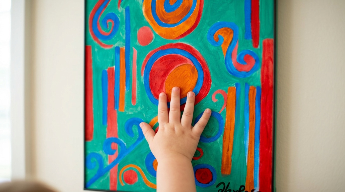
A painting like Robo Friend has somewhere in the region of 40 to 50 distinct contrast boundaries visible from across a room. The strong geometric shapes, the thick black outlines, the areas where bright orange meets deep purple: each of those edges is a piece of visual information that the developing cortex can work with. Compare that to a typical printed black-and-white flash card, which might give you 3 or 4 contrast boundaries at most. The difference in visual richness is enormous.
Visual Tracking: More Than Just Watching
Visual tracking (the ability to follow a moving object or scan a stationary pattern) is one of the earliest and most important motor skills to develop. It requires the eyes and brain to work together in a coordinated way, and it forms the foundation for later skills like reading and hand-eye coordination.
Babies begin developing tracking ability from around 6 to 8 weeks, but the quality of that tracking depends heavily on having had sufficient visual stimulation in the weeks before.
This is where contrast becomes practically important, not just theoretically interesting.
A pattern that has strong contrast gives the visual system a clear signal to track. A pale print in muted tones gives very little to hold onto. When my son Rory was about five weeks old, I noticed he would spend ages staring at Friendly Face, the one with bold blues and oranges against a jet-black background. He wasn't just looking at it blankly. His eyes were moving, scanning the edges of the shapes, following the wavy lines outward from the centre. That was tracking. That was his visual system doing exactly what it needed to do.
When Does Colour Vision Kick In?
Colour vision develops more gradually. Newborns have limited colour discrimination. They can detect some differences, but their ability to distinguish between similar hues is very poor. By around 2 to 3 months, colour discrimination improves significantly as the cone cells in the retina mature and the brain's colour processing areas (particularly V4) develop more connections.
This is why the advice for very young babies (0 to 8 weeks) is often "start with high contrast black, white, and red." Red has long been noted as the first colour babies appear to respond to, likely because the wavelength difference between red and its adjacent colours is large enough that even immature cone cells can detect it.
But here is the thing: by 3 months, colour matters too. A painting that has both strong contrast and bold colour is doing double duty. It is stimulating the contrast-detection circuits that were developing from birth, while also engaging the now-maturing colour vision system.
This is one reason I design my paintings the way I do. They are not exclusively black-and-white. They are bold-coloured on bold-coloured, with thick dark outlines that create contrast at every boundary. The contrast comes from shape and edge as much as from lightness difference. A bright orange circle against a vivid blue background may not have huge luminance contrast, but the chromatic contrast is enormous, and by 3 months that is exactly what a developing brain can use.
Why Hand-Painted Art Has Natural Variation That Printed Cards Don't
This is the part nobody talks about, and I think it is actually important.
When I paint, the contrast is not uniform. A thick brushstroke of black over orange will create a slightly different edge quality in one corner versus another. The paint sits differently. There are micro-variations in thickness and texture that the eye picks up even if you are not consciously aware of them.
That natural variation is stimulating in a different way to a perfectly uniform digital print.
Printed materials are pixel-perfect. Every edge is identical. Every area of colour is exactly the same value as every other area of the same colour. This is great for precision, but from a developmental standpoint it gives the visual system very little to work with beyond the large-scale pattern.
Hand-painted work has what artists call "optical texture": local variations in colour, thickness, and edge quality that the eye keeps finding new things in. A baby looking at Three Friends is not just processing three bold blobs on a checkerboard. They are processing dozens of subtle variations in how those bold forms are rendered, where the paint is thicker, where the brushstroke changes direction.
The visual cortex finds this kind of natural complexity genuinely more engaging. It is not a hypothesis. It is consistent with what we know about the neural architecture of the primary visual cortex, which is specifically tuned to detect local edge variations and spatial frequency changes.
The Face Recognition Connection
There is one more piece of neuroscience worth knowing about.
Babies have a strong innate bias towards face-like configurations. This is hardwired. There is a structure in the fusiform gyrus called the fusiform face area (FFA) that appears to be at least partially pre-specified for face processing. But here is what is interesting: this area is strengthened by early visual experience.
Artworks that include face-like arrangements, even abstract ones, may be doing something useful here. Friendly Face is the most obvious example: two large circular forms for eyes, a curving form below, bold outlines framing the whole thing. It is not a realistic face. But the basic configuration is face-like enough that it may be engaging the same circuits.
I made that painting before I ever thought about its developmental properties. I just found the form compelling. It turned out my instincts as an artist were pointing in the same direction as the neuroscience.
Practical Guidance: Where to Hang It, At What Distance
All of this is interesting in theory, but what do you actually do with it?
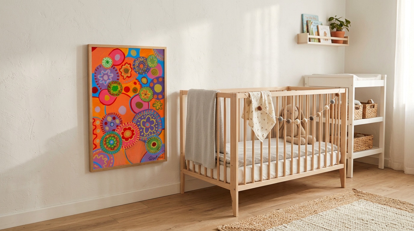
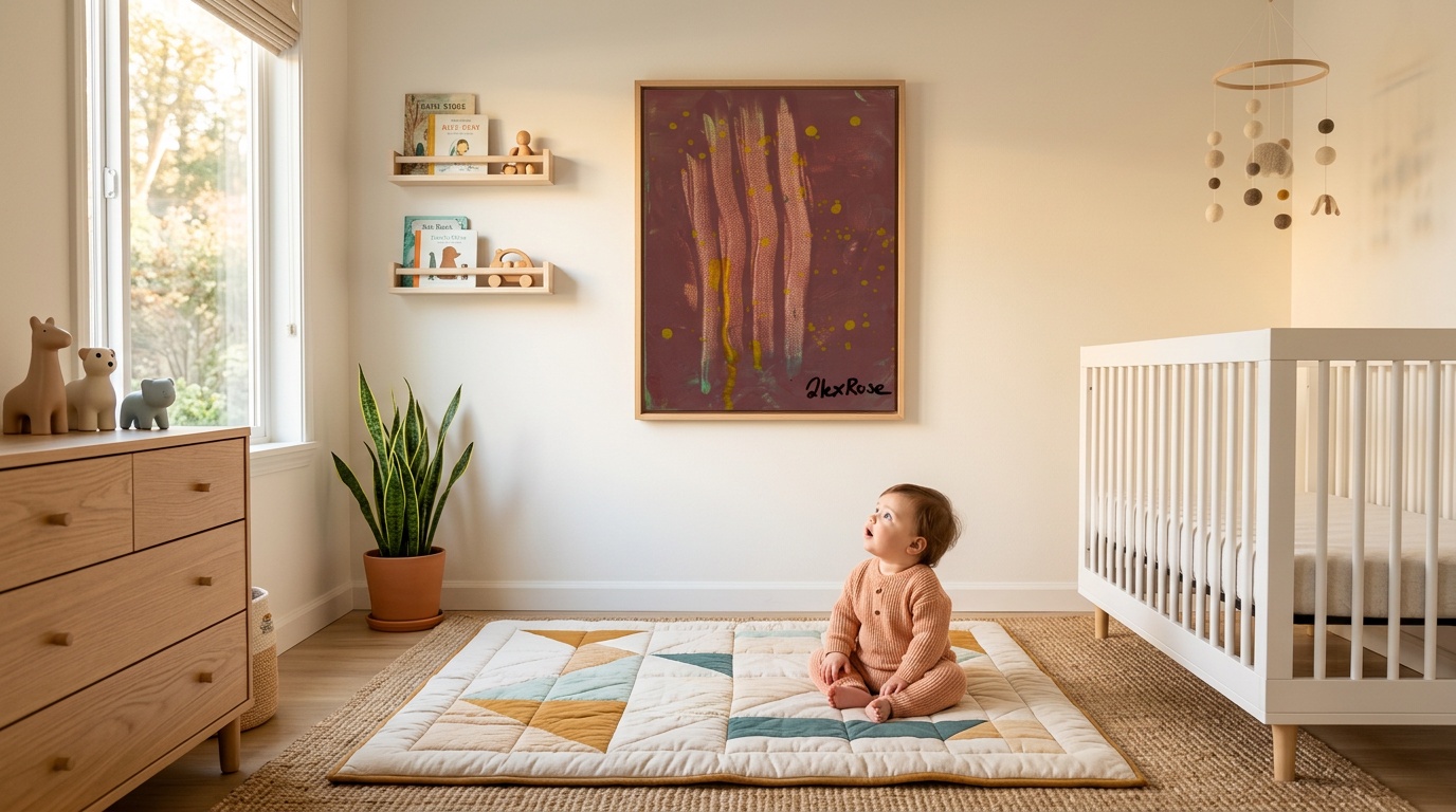
Distance from the baby. In the first 6 weeks, aim for 20 to 30 centimetres. That is roughly the distance from a feeding position to your baby's face. Hang art at the side of the changing table or at the end of the cot where they can see it from that distance. By 3 months, their focal range extends to around 60 to 90 centimetres, so art on the opposite wall of the room starts to become useful.
Height. At lying-down distance, art on the wall beside the changing mat (at the height their head sits) is perfect for newborns. As they begin to sit with support, move art to their eye level in that position. The point is that they should be able to look at it without straining their neck.
Quantity. One or two strong pieces in a given sight line is better than a gallery wall of fifteen. Too much visual complexity in the peripheral field can actually be overwhelming for a very young baby, because the brain cannot yet filter foreground from background effectively. Give them one strong focal point.
When to rotate. Around 3 to 4 months, babies begin to show habituation to familiar patterns, which means they stop responding as strongly to the same stimuli. This is actually a sign of learning, not boredom in the adult sense. The brain has built the circuits to process that pattern and is ready for something new. Rotating the art in the nursery every few weeks from around this age onwards keeps the visual system challenged.
I started swapping paintings in Rory's room once a month from about 14 weeks. The first time I put up Peek-a-Boo in place of something he had been looking at for weeks, he spent about twenty minutes staring at it. That is a serious amount of focused attention for a 14-week-old. The white grid against the hidden colours underneath was completely new spatial information for his brain to work with.
Real Parent Questions: Answered
People ask me similar things over and over, so let me address the most common ones directly.
My baby doesn't seem to look at the art much. Is something wrong?
Every baby develops at their own pace, and visual engagement varies a lot. Some babies are extremely visually alert from birth, others take a few weeks to really start tracking. If you have concerns about your baby's vision or responsiveness, check with your health visitor or GP. That said, if your baby is otherwise meeting milestones and is responsive to faces, the art just might not be positioned optimally yet. Try moving it closer.
Should I really use black and white art, or are bold colours okay?
Bold colours are excellent, especially from 2 months onward. Pure black-and-white gives the strongest possible contrast for the earliest weeks, but once colour vision begins to develop, chromatic contrast (bold colour against bold colour) is genuinely stimulating. You do not have to choose between the two. The paintings in my collection are bold and high contrast.
How long should I leave art in the nursery before rotating?
There is no fixed rule, but roughly 3 to 6 weeks for younger babies (0 to 3 months), and every 4 to 8 weeks from 3 months onward. Watch your baby for signs of habituation, which is when they stop pausing and looking at something they used to engage with. That is your cue to rotate.
Does tummy time change which art is useful?
Yes, during tummy time your baby will be looking slightly downward and forward. Art placed on the floor in front of them (a mat with high-contrast patterns, or a print propped against the wall at ground level) works well here. The visual goal during tummy time is similar: give them something interesting enough to motivate lifting their head.
Is there an age when babies stop needing high-contrast art specifically?
By 6 months, colour vision and acuity are substantially more developed. High-contrast art remains engaging, but it is no longer uniquely important in the way it is for newborns. From this point, the interest in art becomes more about novelty, colour complexity, and the beginning of shape and pattern recognition as a kind of play. Which, if anything, makes bold abstract paintings more interesting over time rather than less.
Which Artworks in My Collection Are Best for Newborns?
If you want a specific recommendation based on everything above, here is where I would start.
For the very youngest babies (0 to 8 weeks), I would look at Three Friends. The thick black outlines on a geometric checkerboard background give exactly the kind of strong, simple, high-contrast signal that underdeveloped visual cortex can latch onto. There is no subtlety here, and for a newborn that is a feature.
Robo Friend is excellent from around 6 to 8 weeks onward, when babies start actively scanning more complex patterns. The geometric interior detail within each colour block gives the eyes multiple contrast boundaries to work through systematically.
Friendly Face has done a lot of heavy lifting in my own house. The face-like configuration engages the circuits I described earlier, and the black background gives maximum contrast. It works well from quite early.
Peek-a-Boo is, in my experience, more of a 3-to-6-month painting. The depth cues implied by the grid overlay are more complex spatial information that younger babies cannot fully process. But from 3 months, it is a consistently engaging piece.
Browse the full collection to see all the options.
One Final Thing
The research is clear, the practical guidance is settled, and the artworks exist. What I want to leave you with is something slightly different: your instinct as a parent to give your baby interesting things to look at is correct.
You do not need a neuroscience degree to act on this. You just need to know that the bold, slightly chaotic, vibrantly colourful work that makes some people say "that's a bit much for a nursery" is almost certainly the best possible thing for the brain inside that small, curious head looking up from the cot.
Start with one painting. Put it somewhere they can actually see it. Watch their eyes.
That tiny flicker of focused attention is a neural pathway forming in real time.
Every baby develops at their own pace. If you have any concerns about your baby's vision or development, please speak with your health visitor or GP.